Color Rules The Stars Of HGTV's Unsellable Houses Swear By
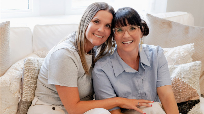
Sisters Lyndsay Lamb and Leslie Davis, stars of HGTV's "Unsellable Houses," have a few color rules they love to live by. For this pair, color is one of the most important solutions they have in their toolbox when it comes to transforming houses. We've rounded up a list of the top things they always keep in mind when revamping a client's home to actually move on the real estate market. But it's about so much more than just the color of the paint on the wall (although that's pretty important, too). Color rules consider everything present in a space — from the paint shades to the furnishings, the decorations (even that funky lamp!) as well as the finishings, too.
For a property to sell (or be enjoyable to live in even if you don't plan to list your house), it needs to visually work. And to work, there are certain rules that need to be followed to create a cohesive color palette for your home. Yet the best thing about these color rules is that they aren't hard and fast. Davis and Lamb offer them as a sort of springboard for your design ideas. It's a bit of a "start here and watch your house sell." There's a reason why they swear by these rules, so keep reading for some tried-and-tested color and painting tips from the HGTV twins.
Give your grays a green undertone to add warmth

There is plenty of talk in the design space about gray being one of those perfect neutral colors, but the stars of "Unsellable Houses" have a little-known fact to share with you: Not all grays are equally neutral. In fact, some of them are too cool to firmly fit the label. If you don't want a cold gray, Lyndsay Lamb recommends Gray Owl by Benjamin Moore. "Now, most grays have a blue undertone that can tend to make gray feel very cool, but Gray Owl is unique as it has green undertones," Lyndsay Lamb shares via Lamb & Co. "The green undertone does a great job of warming the color while letting it remain cool. Truly making it a neutral hue." This means that when you are selecting paint colors, you should be careful about the ones you reach for.
When browsing paint swatches to take home and try out, you might not be able to detect the different undertones from looking at just a piece of paper. You might not even be able to tell right away by looking at the can of paint, either. To be completely sure, speak to the employee at the paint store. A lot of locations, be it The Home Depot, Lowe's, or even your local hardware store, mix up certain colors on-site. Each color comes with a code indicating which primary and secondary colors to mix in to create the shade. So before you have your heart set on a specific gray, ask the employee if its base is blue or green, and they might be able to source the information for you.
Warm creams can make a room feel more inviting

If you want to make your small living spaces seem cozy, inviting, and more spacious, Lamb recommends a shade of warm cream like Alabaster from Sherwin-Williams. "If you are looking for a true warm off-white, then look no further than Alabaster! One of the best colors if you are looking for something a little creamy, but is not yellow!" she reveals on the Lamb & Co. blog. "One of my favorite parts of this color is that it has a high reflective value, so it is a great color if you are looking to brighten up a space or make a room feel larger."
These warm creams are a stroke of good luck for home designers. White is a great backdrop color for any design avenue you would like to take. Whether you're learning how to do maximalist décor as a beginner and are looking to fill the room with accessories and art, or you prefer the modern farmhouse style, a white wall will work for both. But in either case, you want to be careful of things becoming too sterile. Unless you are aiming for an ultra-modern look, you likely don't want your space to feel like a hospital. However, go too warm, and, as Lamb mentioned, everything can start to seem a bit dingey and yellow. A warm cream color like alabaster is the perfect in-between.
Don't be afraid to mix and match colors — meet greige

Something the stars of "Unsellable Houses" want fans to think about when decorating their own homes is this: Don't be boxed in by limits that aren't actually there. Instead, experiment with color a little and see what boundaries you can push. One of Lamb's favorite instances of this is a color combination she now uses often. "Have you heard of the term Graige? It's gray plus beige! Simple as that! But this is a color I have been loving!" she shares via Lamb & Co. "With this unique color combo, you have to look closely to see if the undertones are warmer or cooler."
Fortunately, the HGTV hosts have a few paint recs if you're not sure where to start. Sherwin-Williams has two options that kind of fit the bill and which land squarely on Lamb's list of favorite grays. Repose Gray is a gray that runs a little cooler, making it more textbook gray in color than what Lamb considers to be greige. It's also relatively dark. If you want something a bit lighter instead, the company also has a shade called Agreeable Gray. If you can't find the shade you want, you can also have a custom shade mixed. The best way to do this is to partner with your local paint store or painting contractor. If there is already a greige finish that you like in your space and wish to color match, (it can be as small as the edge on a scatter cushion), bring this along to get it analyzed.
Mixing different colored metals doesn't have to be difficult

Most people think of paint when they consider color rules, but it's about so much more than that. Another place in your home that you'll need to take color into consideration is the kitchen and bathroom fixtures. Your finishings — things like the faucets, drawer pulls, and even light switch covers — might be made of different types of metal. Whether it's copper, chrome, or anything in between, there are rules to follow to help you get the best results. If you want to go all one color, that's fine, but you don't have to stick with singularity because you think you have to.
Here's the trick: "Undertones of the metals are super important when trying to mix and match," Lamb shared on the Lamb & Co. blog. "Nickel, gold, brass, and copper all have warm undertones and can be more easily mixed. While chrome and stainless steel both have cool undertones. However, white and black do not have cool or warm undertones and can be used universally between both color palettes." So there you have it — pay attention to the metal's undertones when selecting the finishes for your space. By doing this, none of them will clash with each other, and you can enjoy a cohesive look.
Bedrooms shouldn't be bold colors

Colors can profoundly impact human emotion and mood. They trigger different responses in us based on hue. For example, warm colors like red, orange, and yellow can bring out energy and excitement, while cool colors like blue, green, and purple can create a calming effect. Blue, in particular, is thought to lower blood pressure and heart rate, making it suitable for bedrooms and meditation spaces. The stars of "Unsellable Houses" are known to abide by these rules, clearly telling viewers that bold colors don't belong in the bedroom.
"There's a time and place for vibrant colors and bold design choices ... But we wanted the main suite to have an overall calming, spa-like vibe, but still feel approachable and liveable. Our design leaned more into neutral, earthy tones and organic textures, with an emphasis on wellness," Lyndsay Lamb wrote on the Lamb & Co. blog about Season 5, Episode 3, of "Rock the Block." If you want to achieve a similar effect, try to avoid bright, upbeat colors in spaces meant for relaxation. If you enjoy bright tones, you can work them into your home in places like the kitchen or even a home office — rooms that are meant for alertness and productivity. Looking for a paint recommendation? The "Unsellable Houses" stars say soft beige paint colors are best for a relaxing bedroom.
The shine of metal and glass goes well with softer colors

When thinking about combining colors in a space, you might only consider what goes on the walls and furnishings. While painting your trim a color that complements the couch you picked out is a great start, coordinating colors in a room doesn't stop there. You also have to consider the other finishes in the space and how they contribute to its overall look. In Season 3, Episode 9, "of Unsellable Houses," Lamb went over the home's new look, stating that the space was "a mix of soft colors, and then we accent some metallics and mirrors so it's very, like, old Hollywood but still comfortable," per Realtor. She went on to label the style "regal elegance."
So if you need help thinking about how to make your space feel more upscale, step back from textiles and paint and start thinking a little bit bigger. A gleaming mirror, a glass table with a metal frame, or some ultra-glossy tiling on the walls as a backsplash can all work together to create an elevated space. The devil is in the details, and metals are one detail that (literally) shines against soft colors. We see this pop up often in the sisters' style — they love mixing metallics with soft pastels, as in the pictured kitchen.
The same color can work on many different home styles

A color rule that the twin HGTV hosts want you to know about is that certain shades aren't strictly tied to certain styles. Whether you lean more toward mid-century modern décor or even Art Deco design, your color palette is unlimited. For example, Quietude by Sherwin-Williams is a paint shade the "Unsellable Houses" stars swear by for brightening up any room, regardless of design style. "If you are looking for a brighter splash, Quietude is a great combination with a slight gray undertone," Lamb writes on the Lamb & Co. blog. "We have used this color on kitchen cabinets, and I love how it brightened up the space! This color works great for a coastal, vintage farmhouse, or craftsman-style home especially!"
You might think that if you want a home with muted colors, you can't be a maximalist. Or that coastal homes have to be baby blue — or any variation thereof. Instead, Lamb encourages those of us designing our homes to broaden our horizons. You can use just about any color you like, as most aren't tied to a specific style. You can also use the same color in many different places around your home. If it works, it works.
Front doors should be a calming color

If you want your house to have major curb appeal, your front door has to do some of the heavy lifting. In Season 4, Episode 4 of "Unsellable Houses," the home just wouldn't move on the market. One of the things Lamb did to make the property stand out to a larger pool of potential buyers was change up the front door. Lyndsay Lamb revealed one of the perfect front door paint colors in the process and showed how important entryway aesthetics are. Your front door is one of the first things people will see when they approach your home, so it needs to be up to snuff. Instead of going for something like a bright red that would certainly stand out, Lamb reached for a more muted color.
The color turns out to be Urbane Bronze by Sherwin-Williams. On their blog, the sisters describe Urbane Bronze as being one of the "finishes we used to bring our earthy boho-inspired design to life." Touted as "rooted in nature" this color is supposed to make guests feel calm and welcomed while also being low-key enough to remain elegant. This might be a tall order for one paint color to pull off, but Urbane Bronze does it in the episode. This earthy tone complements various architectural styles, from traditional to modern. To make things really pop, Sherwin-Williams includes a "Coordinating Colors" section for each shade it sells. In this instance, the bronze pairs well with Shoji White, Extra White, and Ivoire. These creamy beiges make the bronze shine and would work well for siding or trim. When selecting colors for your front door, take advantage of these built-in recommendations from paint companies. They will make the job easier!
Branch out with new colors, even if they aren't trending

While gray, beige, and white are always touted as neutral colors, Lamb insists other hues can also take on the role of neutrals. It all depends on how you use them within a space. "I'm pretty partial to blush right now, and I've been using it in a lot of different ways, just kind of using it more as my neutral and then building other colors on top of it," she said in an interview with Realtor.com. "Leslie is not quite there as a believer yet, but I think I'm about to get to her."
Blush is a great example of a color that can act as a base shade. It is such a light variation of pink that it won't easily overpower a room. If you love blush as much as Lyndsay Lamb, feel free to use lots of it, making the shade a neutral anchor to build off of with your design. Other pale pastel hues, like soft blue and mint green, can also serve as gentle neutrals in a room. Their subdued tones provide a calming backdrop, allowing other elements, such as furniture or artwork, to take center stage instead. Colors inspired by nature, like olive green, terracotta, and deep blue, can also act as versatile neutrals. These earthy hues bring warmth and richness to a space while maintaining a grounded, balanced feel due to their connection to nature. They also pair effortlessly with a range of colors and materials, offering design flexibility.